
 |
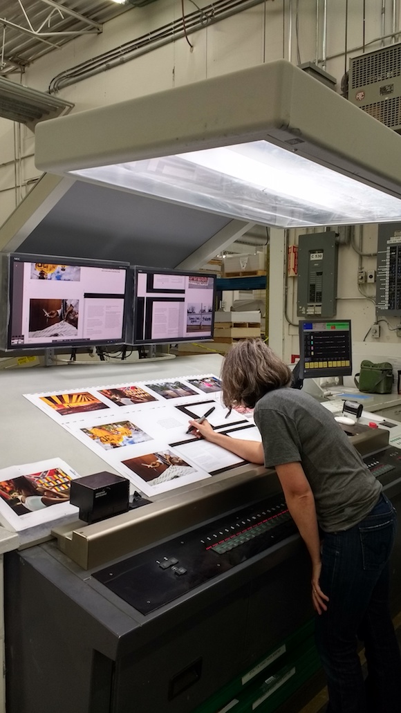
| Spreads from "Black Belt Color: Photographs by Jerry Siegel" at press check with Friesens, Canada. |
In an ever more digital age, fewer and fewer people understand the printing process and how, exactly, it works. Press checks — where a representative from a publisher tweaks and approves every page in a book coming off a printing press — are less common than they used to be, but for color-critical publications (like exhibition catalogues) they can make a big difference. I traveled all the way up to Altona, Manitoba, Canada, recently to do a press check at Friesens, a printer that the museum has used for years. Friesens prints a lot of art books, but the Georgia Museum of Art’s latest publication, “Black Belt Color: Photographs by Jerry Siegel,” needed some special care.

Most people don’t realize that, even when you get proofs from a printer, those pages aren’t always produced on the same machine that will print the final job. Soft proofing, or proofing on a computer screen only, isn’t recommended for color-critical publications. “Wet proofs,” which do come off the actual press, are less common and much more expensive. Even then, printing is as much an art as a science. Friesens has a color profile that graphic designers apply both to individual images and to the final files for a book, which, in theory, tells the computers that run the press exactly how to match the intended color. But specific papers, even white ones, can have a slightly different tone—one that’s a little more blue or more red—and those tiny differences can affect the final result. The Epson proofs that the publisher typically receives to check color try to match the effects of paper tone, but they’re run on what is essentially a big, fancy inkjet printer.
The big four-color press, on the other hand, stretches the length of a room, with, in the simplest cases, one plate each for cyan, magenta, yellow and black ink (watch this one-minute video to see how it works). Together, those four colors can produce a big section of the visible spectrum, but they can’t capture everything, and sometimes tinkering is necessary on press to match the Epson proofs to the client’s satisfaction.

It’s more complicated than just getting a single image right, though. Books are printed in signatures, or chunks of pages divisible by four, and “Black Belt Color: Photographs by Jerry Siegel” was printed in 16-page signatures, meaning usually groups of 16 images at a time. The larger the signature, the more financially efficient a book can be to print because it means fewer sheets run through the press.
Cyan, magenta, yellow and black can be tweaked from levels
of 0 to 100 in columns that run the vertical length of the large sheet of
paper. At the same time, too much ink on the page will look muddy, not accurate
and it won’t dry, either. If one image out of 16 has sections that seem to have
too much red, you can’t just reduce the magenta for the entire press sheet, or
other images may be negatively affected. Getting every image on the sheet to
reproduce as accurately as possible can require creative thinking as well as a
good eye for color and a knowledge of how the process works.
Hillary Brown
Director of Communications
No comments:
Post a Comment